Written by Satyendra | September 07, 2017
As if the issue was not clear already, Google finds itself in the middle of a major makeover. Recently, there was an announcement that the company would undergo reorganization as Alphabet- a variant group of companies that would also have Google as part of it- so that in the near future, the focus on old-school Google products, namely apps, ad networks, and search engines, would be vastly narrowed.
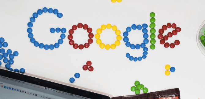
And now, Google has unveiled a new, redefined logo that ditches the typeface originally introduced in 1999 and updates to a sans-serif font known as Product Sans in the company corridors. The old serif logo had an all too serious look about it while lacking in the feel that it was intended to flow from one letter to another.
Compare that to the new logo that is more modern and playful. The colors also come with softer shades of the classic primary hues Google has always seemed to favor. While the feel is modern, there is a sense of simplicity about it all with the letters having a flow, rhythm, and balance to it all.
The new icon is also a breakaway from the traditional static word mark style of a logo. Rather, here you have an animated iconography that transforms on your screen while you interact with Google products. For example, if you run a voice search the logo gets morphed into dots and ripple like sound waves in response to your voice.
To quote the statement from Google, it doesn't simply tell you that you're using Google but also shows you how Google is working for you."
How does it bring into perspective modern design trends?
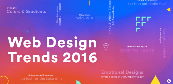
In the last few decades, we were pretty much used to simply landing on a website and experiencing largely the same type of things. While some amount of diversity was always present in typography, illustrations, pictures, and colors, it was always a menu across the top or down the side and various other elements contained in boxes so that one could easily see them and follow commands.
Over time, however, layout artists, UI specialists, and web designers have performed numerous experiments with designs. Each year, we find new design trends emerging and taking website layouts to dizzying new heights. 2015 has been no stranger to such developments as well with modern trends creating a compelling and dynamic experience for the users.
You can check out this link for more on the website design trends that have been observed so far in the present year.
Is Google trying to lay down a platform for the new mobile-friendly world?
Today Google is present everywhere, says Tamar Yehoshua, head of user experience at the company. This is unlike the case a couple of decades back when everyone would remain glued to their desktop computers.
At present, this search engine has been integrated into some of the best cars, smart watches, televisions, tablets, and smartphones while its usage on computers remains. With this new look, Google can now fit into the tiniest of screens.
The brand image is further simplified when their microphone logo pops up in the form of a colorful mic icon or animated dots go bouncing around every time Google is thinking. This new icon that favors a single-letter has also changed to a multi-colored feature in the browser tab. Space is no more a constraint as Google continues working its wonderful color branding into every corner.
Also, it requires a low bandwidth to get up and get running. This may not be a significant change to many but for those in India and China- markets the company has always been targeting- this will come as a blessing since high-speed data plans are yet to reach affordable rates for the common man.
Be a part, embrace the change With Google having tried something new and moved on to a more mobile-friendly, interactive typography, it won't come as a surprise if some of the other giants of the software world follow suit.
The world of typography has come a long way in the last few decades. While the vast number of options has given web designers a bigger pool of resources to choose from, it has also posed a risk to some who may well get left behind in the race for dominance.
If you wish to ride this wave of change and see your business reaching the pinnacle of success, read this article on the latest trends in web design characterized by dramatic typography.
You can thank us later!